

How to be creative with colors and textures
Patern Joy
Playing with textures was always interesting to me. I still have that secret wish to become pattern designer and to make home decor and other exciting things where all the crazy patterns can be applied.
One of the patterns I made was this one, named Joy. It’s bright colors and joyful design were the base for it’s name.
Pattern Joy was made in one of the course I attended few years ago.
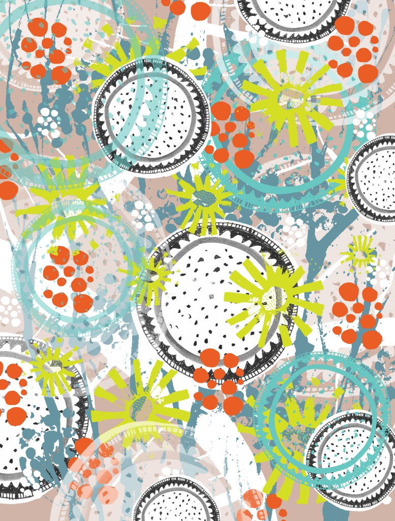
I was following one of the rules in making patterns – you need to make several layers so the pattern has depth.

Although, I really like simple patterns, especially in illustrations.

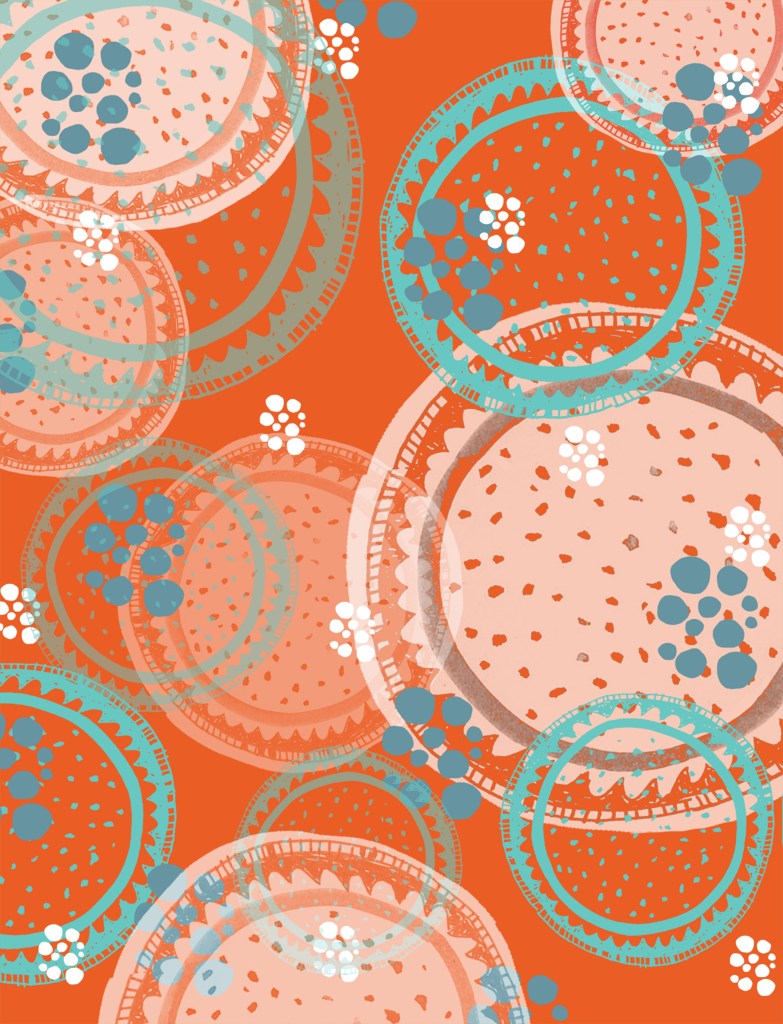
I really like the black one. It looks like a child drawing. It was printed (I think I used stick or sponge) on paper with black paint, and then the colors were inverted digitally.

This is also printed with cardboard on paper. I like to use handmade stamps. Can you see that the same pattern is used for blue and for white branches? I just flip them.
The first pattern is the finished version, combined out of all the others that are shown after it.

Little playing with textures and color in app and voila!
Can you find all of the patterns in the finished version?
